
Designed to Feel Like Care, Not Clinical. Healthcare brands optimize for trust signals. I optimized for emotion, warmth, calm, the feeling of being looked after. Because the user isn't in a hospital, they're at home with family.

Spent the past decade working across the full arc of a product, from shaping direction to building and shipping what people use. Experience spans early-stage startups and larger teams, with a consistent focus on getting the right thing built. I work from idea to working product, using modern tools and AI to close the gap between concept and reality. Most of my time goes into refining working prototypes, using tools like Claude and OpenAI Codex to shape the product as it is built.
HealthFirst. A healthcare platform for the people who manage their family's health, not just their own.
Designed to Feel Like Care, Not Clinical. Healthcare brands optimize for trust signals. I optimized for emotion, warmth, calm, the feeling of being looked after. Because the user isn't in a hospital, they're at home with family.

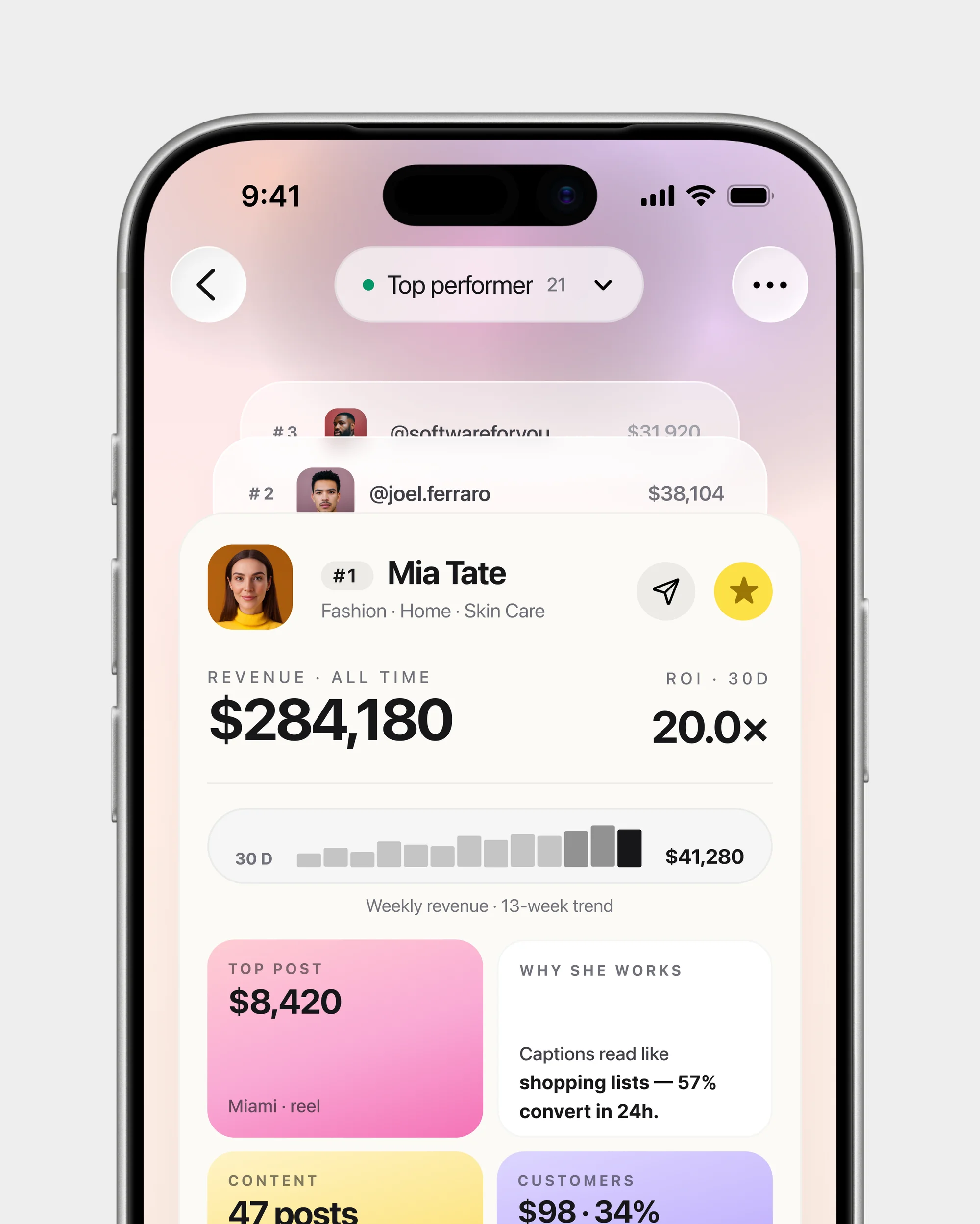
A Dashboard for Caregivers, Not Just Patients. Most health apps assume you're the patient. You're managing a parent, a child, a partner. I reframed the home screen as a command center: twelve alert types, one tap to act.

Conversational Booking, with a Safety Net. Most healthcare apps trap users in 8-field forms. I designed a hybrid: AI chat for users who know what they need, guided steps for those who don't, same component layer.

One Entity, Six Jobs to Be Done. An appointment isn't one thing, it's a booking, reschedule, cancellation, share, follow-up, or jump to lab results. Six contextual sheets, one shared foundation.

Designed for Relational Users. People manage their family's health, not just their own. Each member is a first-class citizen with their own profile, alerts, and care plan, shared and personal.

AI That Reads the Room. The AI knows your doctors, family, history. Open it and three suggestions wait, book a follow-up, schedule a home test, add an appointment for mom. Anticipation, not automation.

B2B Workflows, B2C Experience. Insurance pre-auth is hospital-grade: five steps, conditional logic, document uploads. See coverage, sum insured, and expiry at a glance, complex made approachable.

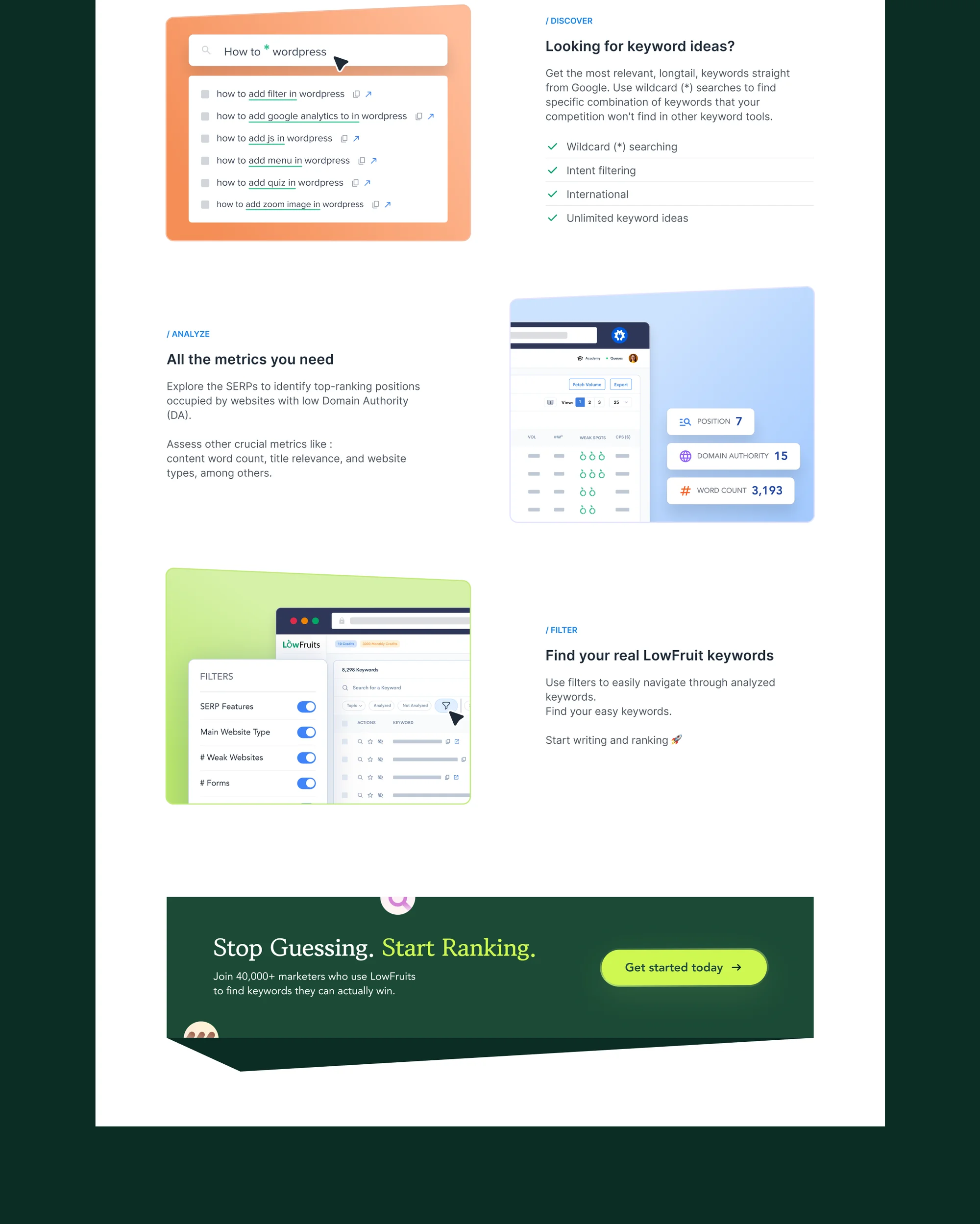
One Search, Four Data Sources. Health data lives in silos, appointments, doctors, records, bills. I designed one search that crosses all of them. Tabs are an admission that your IA failed.

A System That Scales With the Product. Fifty-five components, semantic tokens, four sheet patterns with documented rules. I didn't just design components, I wrote the governance for when to use which.

Accessibility, by Default. High-contrast mode, text scaling, ARIA roles, focus management, skeleton loaders with minimum display times. Accessibility was a constraint from the first component.
Orime. Rewards intelligence for Indian cardholders, because using your own points shouldn't be this hard.

Rewards Shouldn't Feel Like Work. Most rewards apps treat points like a currency you manage, dashboards, calculators, transfer tables. Every screen here feels like money found, not money managed. A gift, not a second job.

Action Over Browsing. Most rewards apps open to deals and promotions. This opens to what you're about to lose, points expiring Friday, fee waiver ₹8,000 away. Only what needs a decision right now.

Points, Cash, and Earn-Back in One Drag. Points or cash? How much of each? What do I earn back? Three questions at every checkout. One slider answers all three. Earn-back leads the hierarchy.

Your History in One Feed. Flights booked, bills paid, points transferred, rewards pending, EMIs active, five systems collapsed into one timeline, grouped by month with urgency badges that escalate toward deadlines.

One App, Three Industries. Flight booking, rewards redemption, and retail shopping, three products competitors sell separately. Same navigation, same card system, same checkout. Users never portal-hop.

Invisible Intelligence. Fifteen engines run behind every screen, right card at checkout, best transfer partner on top, fare calendar tuned to your earn rate. No chatbot, no "AI Picks" tab. Intelligence you feel but never see.

Search That Collapses Nine Products. Flights, hotels, products, billers, vouchers, partner stores, one input field. Results self-categorize as you type, each content type in its own layout. No tabs, no filters. Just type.

Wishlist Without Boundaries. Most apps let you save one content type. This wishlist holds flights, hotels, gift cards, products, all in one place, organized into user-created collections. Intent doesn't respect product categories.

Nine Product Types, One Experience. A boarding pass. A gift card PIN. A hotel cancellation. A utility receipt. Nine completely different data shapes, one checkout, one activity feed, one detail pattern.

Built for the Multi-Card Holder. Every competitor assumes one card. The real Indian user carries three to ten, different earn rates, benefit cycles, expiry dates. This product doesn't just track them, it thinks across them.
AIOSEO, 4.5 years of shaping search. WordPress's most-used SEO plugin, product, marketing, design system, and two sub-brand refreshes.

Designing Within Decisions Already Made. 3M+ installs, years of engineering momentum, no design system. I joined as the first designer, shaping UX through variations that earned buy-in, unifying the product across 60+ releases.

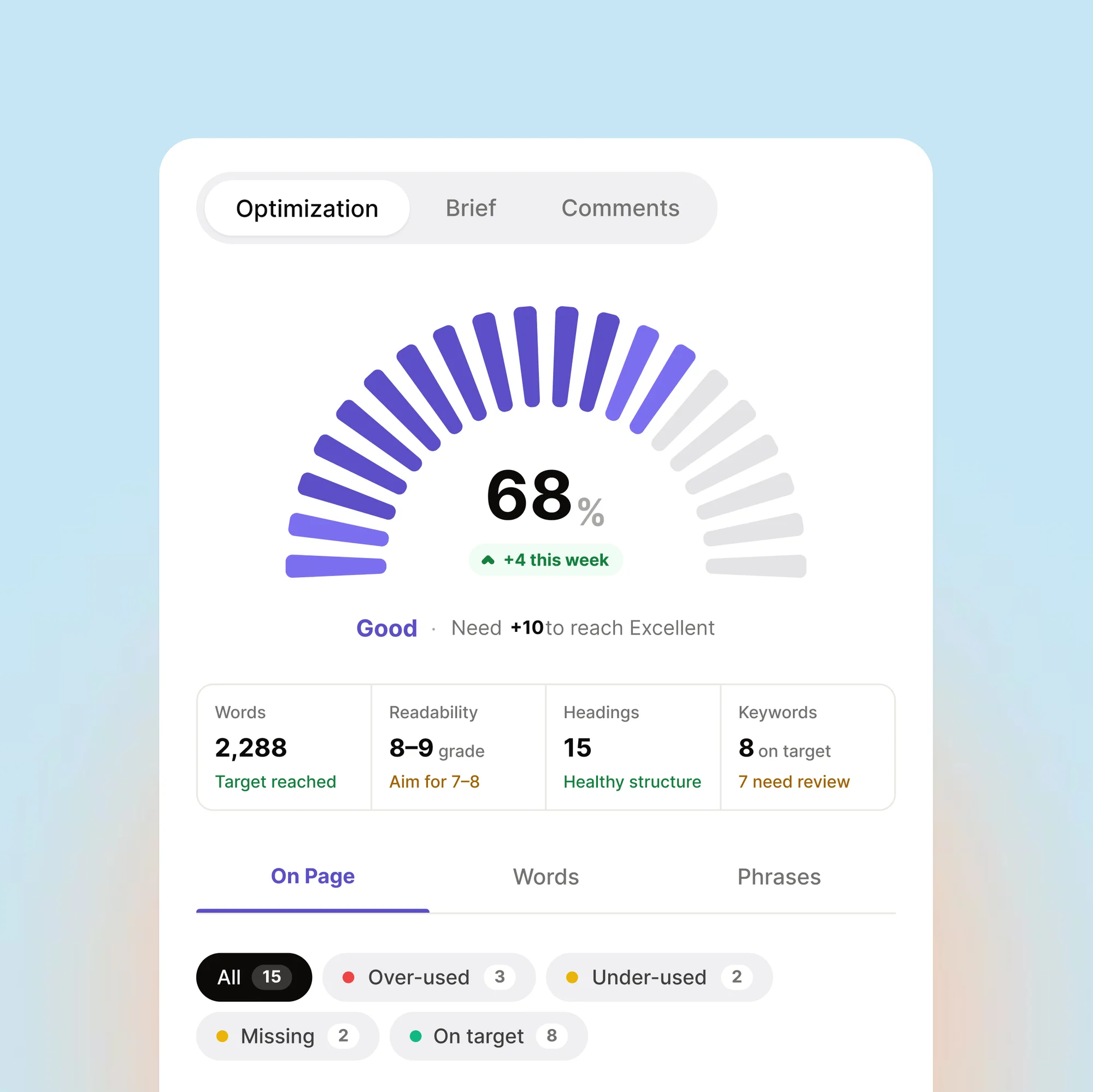
TruSEO, A Score That Teaches. SEO scores are usually a number you can't act on. I explored moving analysis closer to the content, the version that won put a highlighter inside the editor, marking phrases that need work.

SEO Outside the Dashboard. A full SEO audit inside a browser popup. The plugin had depth, the popup had constraints. I explored collapsible sections and score-first layouts, the version shipped gives the answer at a glance.

AI That Assists, Not Replaces. Full article generation was the obvious move. Instead, the suite stayed focused: titles, descriptions, FAQs, summaries, social posts. The design challenge was making AI feel like a shortcut, not a takeover.

Page Builders Aren't Edge Cases. Eight page builders, each with its own editor paradigm. The easy path was a floating panel. We chose native integration, SEO controls inside each builder's UI. Eight times the work, but the user never leaves.

Search Console, Made Readable. Google Search Console data was raw. I designed multiple ways to surface it, the direction that landed reframed it as content rankings. Which posts are rising, falling, indexed. Trends and actions, not raw metrics.

LLMs.txt, Designing for the Next Search Engine. AI search engines need a way to read your site. We shipped LLMs.txt before most competitors acknowledged the problem. The challenge was making something invisible feel worth configuring.

Schema Without the Schema. Schema is critical for rich results and invisible to users. The existing implementation was technical. I proposed a visual approach, pick a type, fill familiar fields, JSON optional.

Is Google Actually Seeing This?. We needed an index status report. The data was dense, crawl status, fetch results, schema validation. I explored table-heavy and status-first layouts. The shipped version leads with: indexed or not.

Two Sub-Brands, One Design Language. LowFruits and SEOBoost came in as acquisitions with their own identities. I led the visual refresh for both, unifying under AIOSEO while preserving what made each recognizable. Shared type, distinct colors.
Attrib - Mobile App Design
Edrahi - Mobile App Design
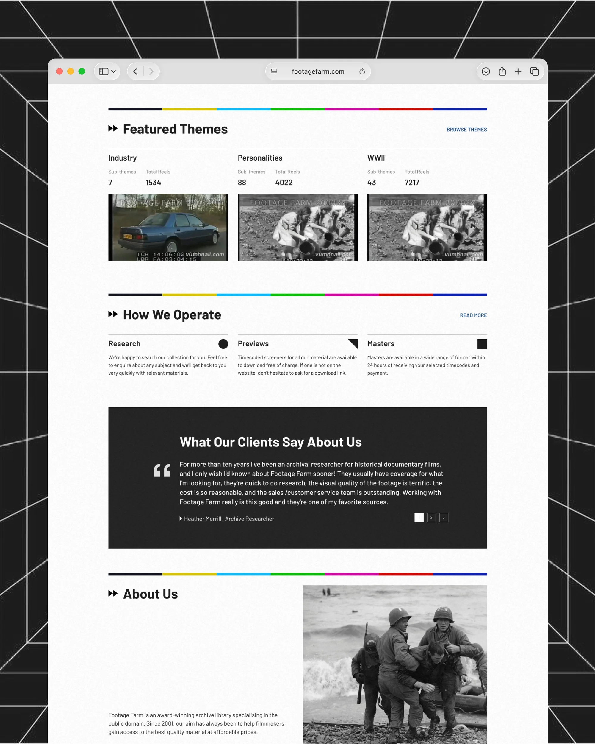
FootageFarm - Website Design
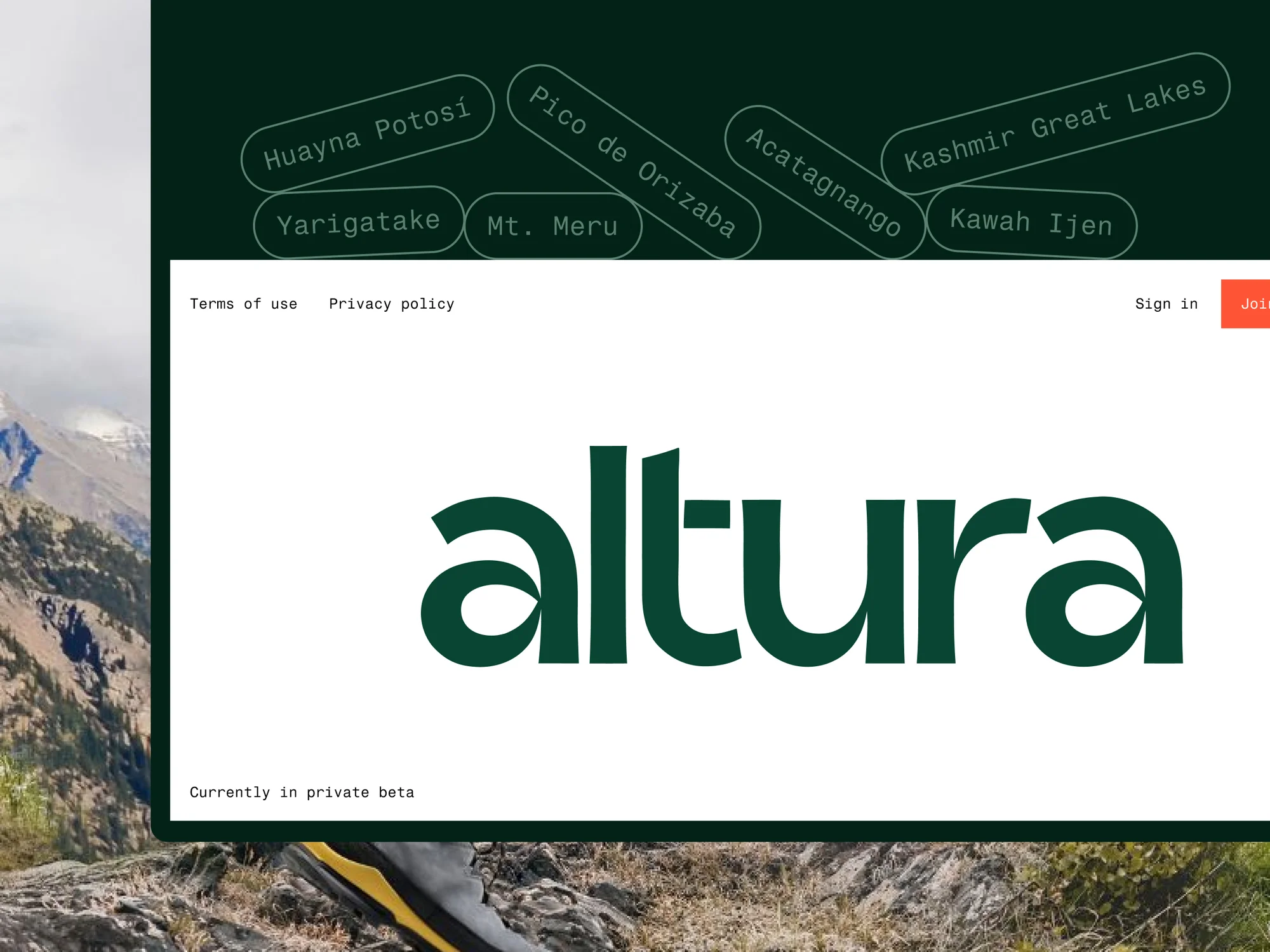
Altura - Website Design
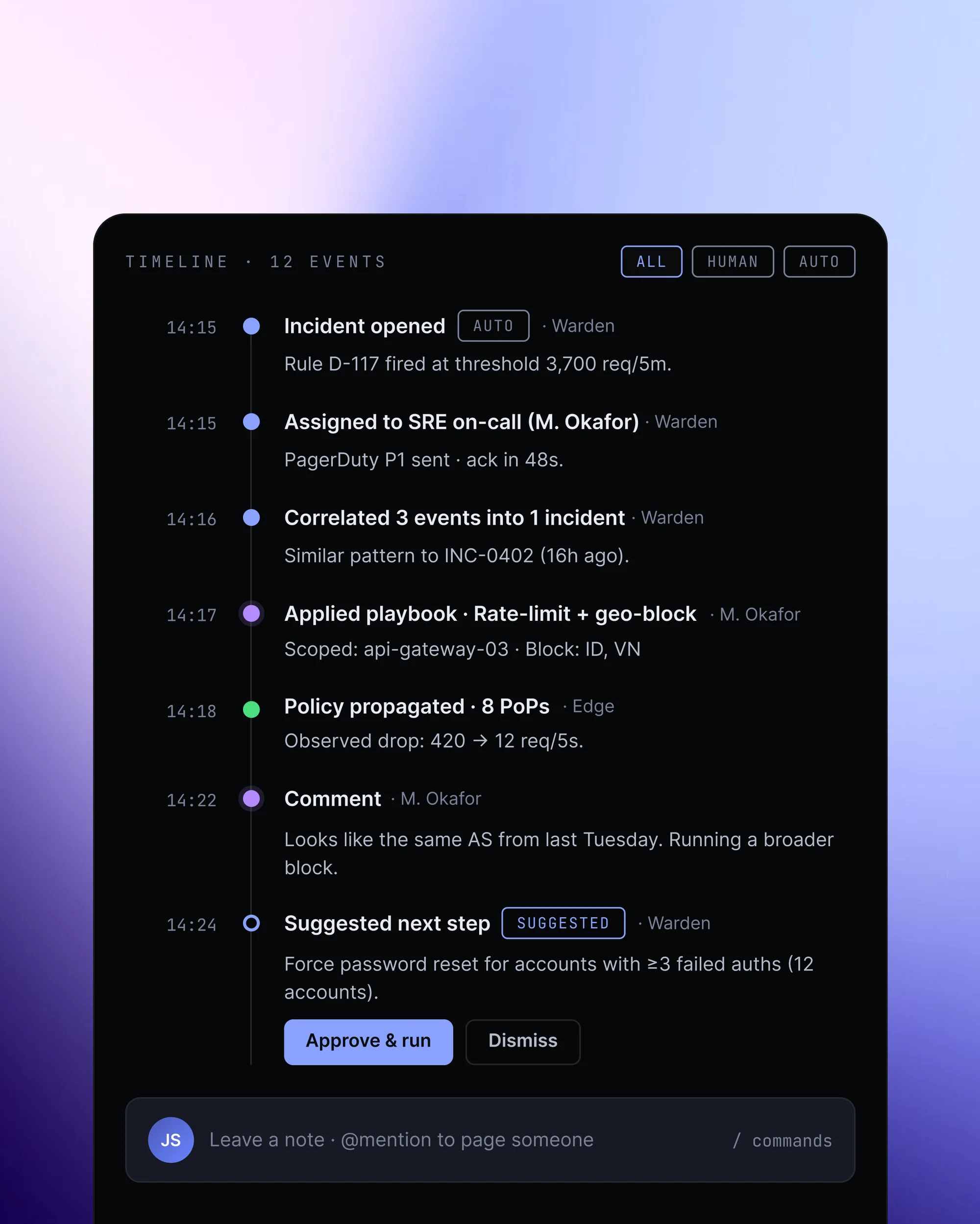
Warden - Webapp Design
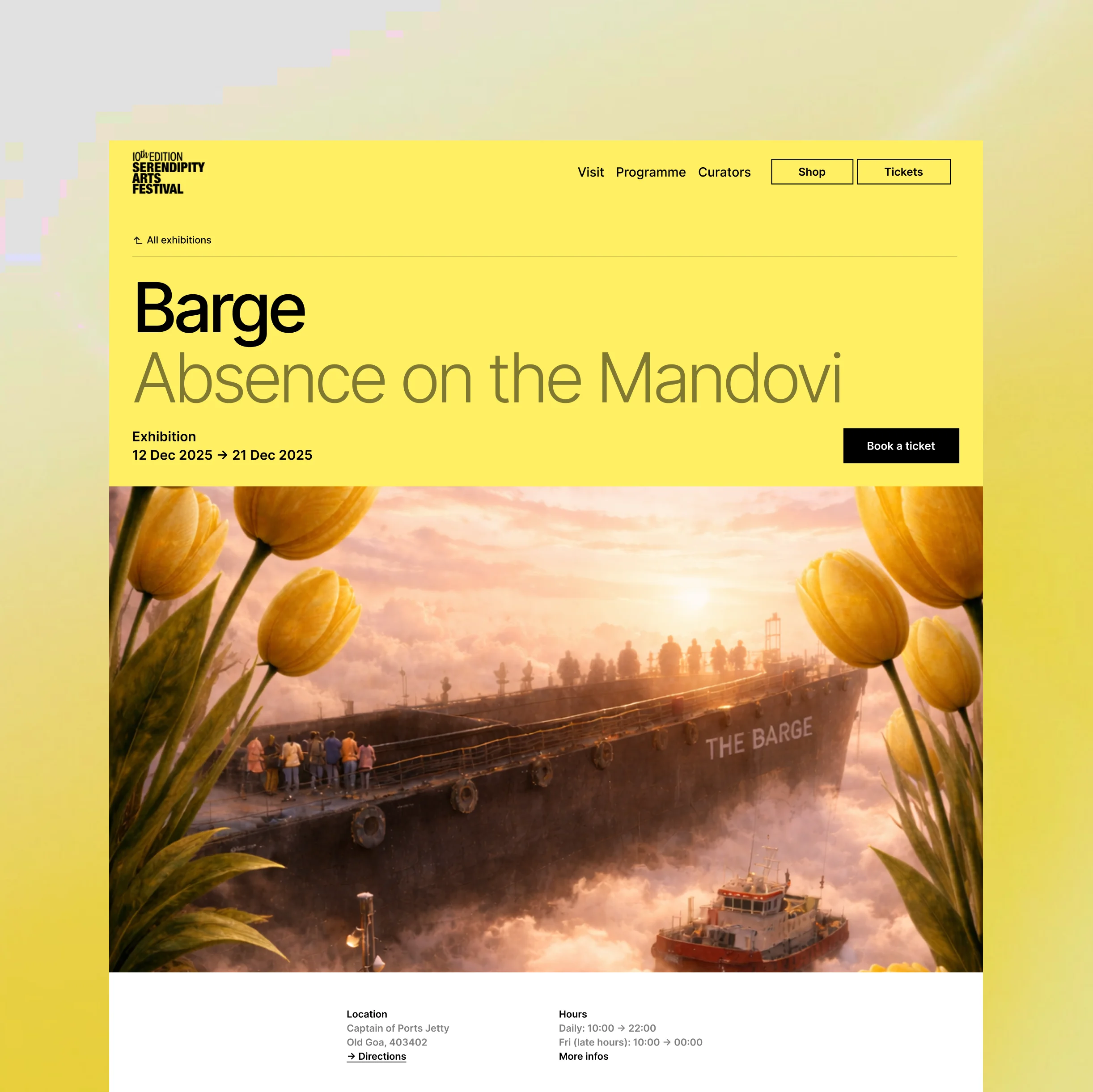
SAF - Website Design
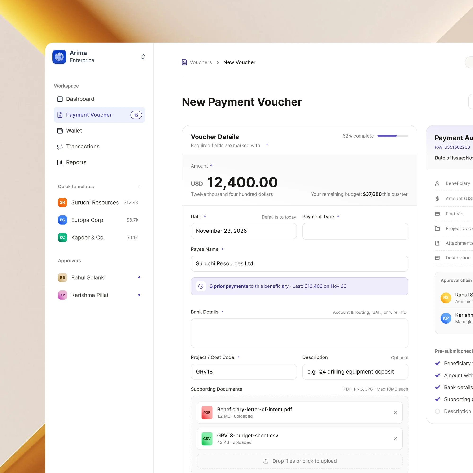
Arima - Webapp Design
Zoro - Mobile App Design
SEOBoost - Webapp Design
WeRead - Mobile App Design
Widget - UI Design
LowFruits - Website Design
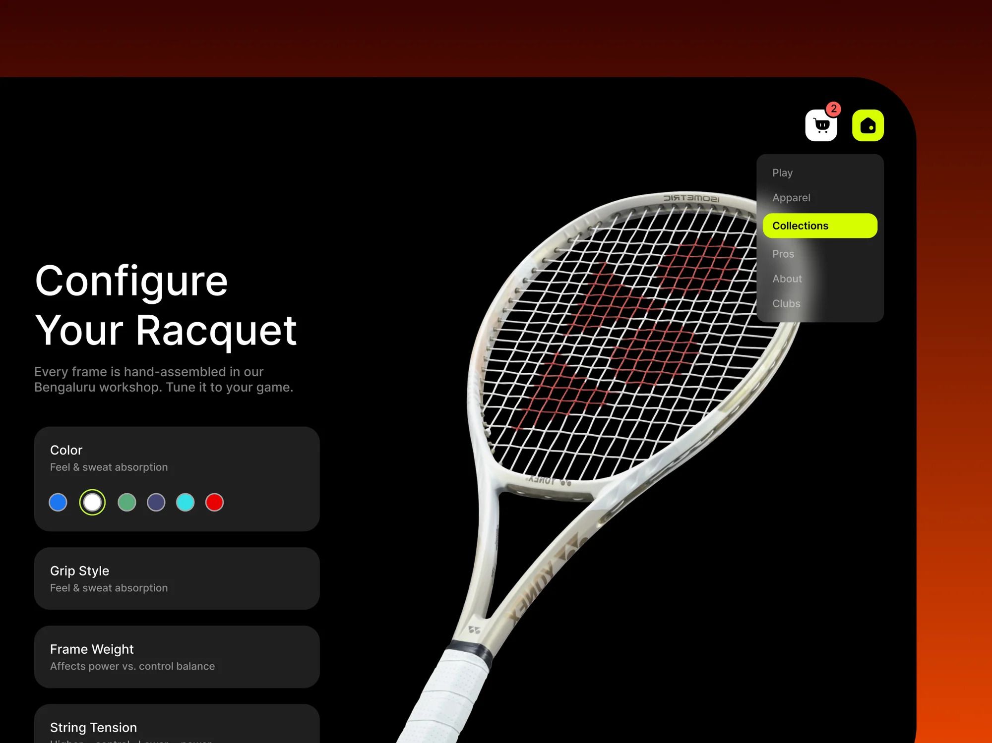
AceTennis - Website Design
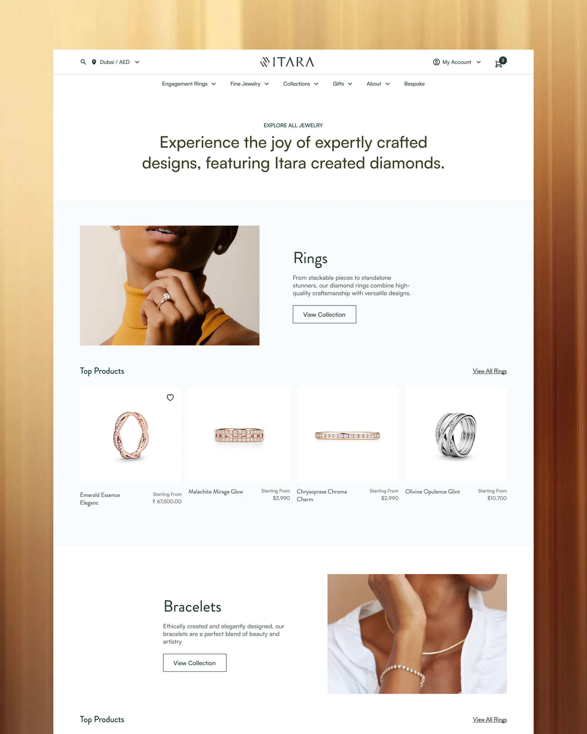
Itara - Website Design
LAFincorp - Mobile App Design